Up and Running with Hotwire Native Android Part 5 - Custom Android Keyboard Extension
In the last few posts, we have achieved a lot. We rendered our Rails app within a native app with very few lines of code. We added some navigation tricks that demonstrate how to make the app feel native and finally we added bridge components to demonstrate native sprinkles such as a Save button on our modals.
However, we are really just beginning to touch on what’s possible. Between the native APIs and web APIs, the world is truly your oyster.
Today we are going to build a keyboard extension for our Rails app. This will combine our Kotlin, JavaScript, Trix and various other tidbits to truly delight the end-user.
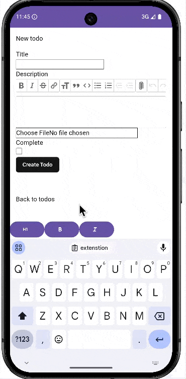
Here is what we are building:
Creating the JavaScript Bridge Component
The first place to start is on our server. Remember, we start with the JavaScript that sends the message to the server.
Afterwards, we need to manipulate the Android views to display a toolbar that sits just above the keyboard when the focus event is sent.
So let’s start by creating a new file called keyboard_controller.js in app/javascript/controllers/bridge in our Rails app.
Since this is primarily a Android tutorial, I’m just going to give you all the code.
import { BridgeComponent } from "@hotwired/hotwire-native-bridge"

export default class extends BridgeComponent {
  static component = "keyboard"

  connect() {
    super.connect()
    this.setUpToolbarListeners()
  }

  toggleToolbar() {
    this.send("focus", {}, () => {})

  }

  setUpToolbarListeners() {
    const element = this.element

    this.send("heading1", {}, () => {
      this.toggleAttribute(element.editor, "heading1")
    })

    this.send('bold', {}, () => {
      this.toggleAttribute(element.editor, "bold")
    })


    this.send('italic', {}, () => {
      this.toggleAttribute(element.editor, "italic")
    })


    this.send('undo', {}, () => {
      element.editor.undo()
    })


    this.send('redo', {}, () => {
      element.editor.redo()
  })
  }


  toggleAttribute(editor, attribute) {
    const isActive = editor.attributeIsActive(attribute)

    if (isActive) {
      editor.deactivateAttribute(attribute)
    } else {
      editor.activateAttribute(attribute)
    }
  }
}
Now that we have the JavaScript setup, let’s go through exactly what’s it’s doing.
First things first, when we receive the focus event, we call the toggleToolbar method which sends a “focus” message to the Android app.
In our app/views/todos/_form.html.erb, we call the method when we focusin and focusout of the text area input.
  <div>
    <%= form.label :description, style: "display: block" %>
    <%= form.rich_text_area :descritpion, data: {controller: 'bridge--keyboard', action: 'focusin->bridge--keyboard#toggleToolbar focusout->bridge--keyboard#toggleToolbar'} %>
  </div>
In our setUpToolbar method, we are responding to messages we receive from the Android app and toggling the Trix button on/off.
Now that we have the JavaScript setup, we can move on over to the Android side.
Adding a toolbar
We are going to display a toolbar wherever we have a form and that could be anywhere. The default Android View that is rendered comes from the Hotwire Native library. We need to create our own and add the toolbar.
Create a new fragment called WebFragment as well as a layout file called fragment_web_home
@HotwireDestinationDeepLink(uri = "hotwire://fragment/web")
open class WebFragment : HotwireWebFragment() {
    override fun onCreateView(inflater: LayoutInflater, container: ViewGroup?, savedInstanceState: Bundle?): View? {
        return inflater.inflate(R.layout.fragment_web_home, container, false)
    }
}
Next, create the corresponding layout.
<?xml version="1.0" encoding="utf-8"?>
<androidx.constraintlayout.widget.ConstraintLayout
    xmlns:android="http://schemas.android.com/apk/res/android"
    xmlns:app="http://schemas.android.com/apk/res-auto"
    android:layout_width="match_parent"
    android:layout_height="match_parent">


    <com.google.android.material.appbar.AppBarLayout
        android:id="@+id/app_bar"
        android:layout_width="match_parent"
        android:layout_height="56dp"
        app:layout_constraintEnd_toEndOf="parent"
        app:layout_constraintStart_toStartOf="parent"
        app:layout_constraintTop_toTopOf="parent">

        <com.google.android.material.appbar.MaterialToolbar
            android:id="@+id/top_toolbar"
            android:layout_width="match_parent"
            android:layout_height="wrap_content" />
    </com.google.android.material.appbar.AppBarLayout>

        <FrameLayout
            android:layout_width="match_parent"
            android:layout_height="match_parent">

            <include
                layout="@layout/hotwire_view"
                android:layout_width="match_parent"
                android:layout_height="match_parent" />
        </FrameLayout>

    <!-- Bottom toolbar -->
    <LinearLayout
        android:id="@+id/bottom_toolbar"
        android:layout_width="match_parent"
        android:layout_height="wrap_content"
        android:orientation="horizontal"
        android:gravity="start"
        android:background="?attr/colorBackgroundFloating"
        app:layout_constraintBottom_toBottomOf="parent"
        android:elevation="0dp"
        android:visibility="invisible"
        >
    </LinearLayout>

</androidx.constraintlayout.widget.ConstraintLayout>
Now that we have a bottom toolbar, we can start manipulating it. I have left the colors as they are and have not styled it. That is an exercise up to the reader.
Creating our Bridge Component
Let’s start by creating and registering our Bridge components.
class KeyboardComponent(
    name: String,
    private val delegate: BridgeDelegate<HotwireDestination>,
)  : BridgeComponent<HotwireDestination>(name, delegate) {
`    override fun onReceive(message: Message) {}
}
Let’s register it in our Application file.
      // Bridge
Hotwire.registerBridgeComponents(
  BridgeComponentFactory("form", ::FormComponent),
  BridgeComponentFactory("keyboard", ::KeyboardComponent)
)
Now we can start building.
Building the buttons
When a user clicks on the Trix field, that is when we show the toolbar but before we do that, we must build the toolbar.
class KeyboardComponent(
    name: String,
    private val delegate: BridgeDelegate<HotwireDestination>,
) : BridgeComponent<HotwireDestination>(name, delegate) {

    private val fragment: Fragment
        get() = delegate.destination.fragment

    private val bottomToolbar: LinearLayout?
        get() = fragment.view?.findViewById(R.id.bottom_toolbar)

    private var hidden = true
    private var built = false

    override fun onReceive(message: Message) {
        when (message.event) {
            "focus" -> handleFocusEvent()
            else -> Log.w("KeyboardComponent", "Unknown event for message: $message")
        }
    }

   private fun handleFocusEvent() {
        buildKeyboard()
    }
Our buildKeyboard method needs to create buttons that can be added to the toolbar. We also need to download some drawable icons. I download my drawable icons from Pictorgrammer.
We are going to download format-header-1, format-italic and format-bold. Be sure to click the advanced drop-down to download the XML vector.
Once our icons are downloaded, we can build out our function.
  private fun buildKeyboard() {
        if (!built) {
            addButton("heading1",R.drawable.format_h1_24px)
            addButton("bold", R.drawable.format_bold_24px)
            addButton("italic", R.drawable.format_italic_24px)
            built = true
        } else {
            built = true
        }
    }

    private fun addButton(eventName: String, iconRedId: Int?) {
        val btn = fragment.view?.context?.let {
            MaterialButton(it).apply {

                setOnClickListener { replyTo(eventName) }

                iconRedId?.let {
                    icon = rootView?.context?.let { it1 -> ContextCompat.getDrawable(it1, it) }
                    iconGravity = MaterialButton.ICON_GRAVITY_TEXT_START
                }

            }
        }
        bottomToolbar?.addView(btn)
    }
Finally, we just need to show/hide the keyboard when the field is focused.
private fun toggleKeyboard() {
        hidden = !hidden

        if (hidden) hideToolbarButton() else showToolbarButton()
}
Then update our handleFocusEvent function to toggle the keyboard.
    private fun handleFocusEvent() {
        buildKeyboard()
        toggleKeyboard()
    }
There you have it. Of course, the toolbar needs work to blend into your app but this is a great feature to build if you want to build a markdown editor in your app that’s accessible via mobile.
The final code is as follows.
class KeyboardComponent(
    name: String,
    private val delegate: BridgeDelegate<HotwireDestination>,
) : BridgeComponent<HotwireDestination>(name, delegate) {

    private val fragment: Fragment
        get() = delegate.destination.fragment

    private val bottomToolbar: LinearLayout?
        get() = fragment.view?.findViewById(R.id.bottom_toolbar)

    private var hidden = true
    private var built = false

    override fun onReceive(message: Message) {
        when (message.event) {
            "focus" -> handleFocusEvent()
            else -> Log.w("KeyboardComponent", "Unknown event for message: $message")
        }
    }

    private fun handleFocusEvent() {
        buildKeyboard()
        toggleKeyboard()
    }

    private fun buildKeyboard() {
        if (!built) {
            addButton("heading1",R.drawable.format_h1_24px)
            addButton("bold", R.drawable.format_bold_24px)
            addButton("italic", R.drawable.format_italic_24px)
            built = true
        } else {
            built = true
        }
    }

    private fun addButton(eventName: String, iconRedId: Int?) {
        val btn = fragment.view?.context?.let {
            MaterialButton(it).apply {

                setOnClickListener { replyTo(eventName) }

                iconRedId?.let {
                    icon = rootView?.context?.let { it1 -> ContextCompat.getDrawable(it1, it) }
                    iconGravity = MaterialButton.ICON_GRAVITY_TEXT_START
                }

            }
        }
        bottomToolbar?.addView(btn)
    }

    private fun showToolbarButton() {
        bottomToolbar?.visibility = View.VISIBLE
    }

    private fun hideToolbarButton() {
        bottomToolbar?.visibility = View.GONE
    }

    private fun toggleKeyboard() {
        hidden = !hidden

        if (hidden) hideToolbarButton() else showToolbarButton()
    }
}
Until next time, happy hacking.